
Things to consider:
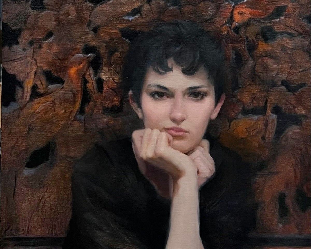
My biggest problem was too much chroma. I just couldn't get a handle on it on each area of the face. I had a mentor in the beginning who helped. Then, I studied countless artists and books looking for solutions once I wasn't able to continue to study with him.
Be humble and willing to be taught. Keep the mind open and paint as often as you can from life.
When choosing colors for your palette, ask yourself:
What do you personally like? Do you like saturated portraits? Warm? Cool? Traditional? Pick accordingly.
Be humble and willing to be taught. Keep the mind open and paint as often as you can from life.
When choosing colors for your palette, ask yourself:
What do you personally like? Do you like saturated portraits? Warm? Cool? Traditional? Pick accordingly.

Essential Reds
There are three reds I love right now. They are Cadmium Red, permanent Alizarin crimson and Transparent Oxide Red. Sometimes I just use one or the other but its usually one of those three.
Accessory Medium
Solvent-Free Gel
I always have a tube of Gamblin Solvent-Free Gel on hand. It really moves the paint once its sticky and dries quickly.
Oil Paint Brands
I have a handful of brands that I use regularly. They include Vasari, Michael Harding, Blue Ridge and Gamblin. They just seem to be more buttery and have the clarity of colors that I like.
Mentorship Openings
Get Personalized Learning with Liz
Write your awesome label here.